
Data misinterpretation in policy: When accurate data still misleads
Summary: Data misinterpretation is the selective, incomplete, or skewed reading, framing, or presentation of accurate data that produces a false or misleading understanding of what it shows. According to a new European Training Foundation report on the topic, this happens routinely in education, employment, and migration statistics — not through invented numbers, but through choices about framing, comparison, and context. The report, based on a working session at the ETF Monitoring Forum "Evidence in Action" (Milan, October 2025), argues that some selective interpretation can be legitimate if it stays transparent and evidence-faithful, but that fabricating or altering figures is never acceptable.
Can a statistic be completely accurate and still send people to the wrong conclusion? According to an ETF report on data misinterpretation, the answer is yes; more often than most data professionals would like to admit.
Here is an example: One national programme monitored by an ETF partner had only a handful of graduates. Every one of them left the country after finishing their studies. Measured at the programme level, this produced a brain-drain rate of 100 per cent. The statistic was entirely accurate. It was also almost certain to mislead and publishing it as a standalone programme-level finding risked making a marginal case look like a major national trend, and could have sent a distorted signal to prospective students.
Rather than publish the figure on its own, the country's data professionals chose not to display that very small programme separately in the main results, while keeping it folded into the wider totals and documenting the decision in the metadata.
Similarly, a rise in school enrolment can be presented as evidence of success. The same figures can also be used to argue that progress is too slow. Neither interpretation necessarily changes the data itself. What changes is the way the information is framed, emphasised, and communicated.
These cases are just some of the findings of the Monitoring Forum "Evidence in Action," held in Milan in October 2025, where national statisticians, education officials, and Torino Process coordinators from Eastern and Southeast Europe, Central Asia, the South Caucasus, North Africa, and the Middle East spent a working session examining how correct data can still create a false or distorted picture of reality once someone puts it to use.
What is data interpretation? the data-to-meaning continuum
Most conversations about data quality focus on collection and analysis — getting the numbers right, and figuring out why they look the way they do. The ETF's report zeroes in on the stage in between: interpretation, the moment when a statistical result is first translated into a claim about a problem, a success, or a policy priority.
The report calls this progression the "data-to-meaning continuum":
Collection and description — capturing what was measured, how, and under what rules, plus neutral summaries such as counts and rates.
Interpretation — selecting, framing, and emphasising elements of the data for a specific question or audience.
Analysis — explaining why the results look the way they do.
The stages blur together in real work, but the report argues interpretation deserves special scrutiny, because it is where choices about what to highlight, compare, or leave out first start shaping how a policy debate unfolds — before those choices harden into analysis, recommendations, or public argument that becomes much harder to correct.
"The numbers themselves are rarely wrong, but can tell very different stories," one participant observed during the discussions.
How common is data misinterpretation in practice?
When participants were asked to share their own experience, examples surfaced almost immediately. Several described data misinterpretation as something that "happens everywhere", not an exotic malpractice, but part of their "everyday work" in reporting, media coverage, policy design, and routine review.
Part of the reason, one participant suggested, is that verification is expensive:
"in many review processes, the data is taken on trust, because triangulation and verification are time-consuming."
When these shortcuts are taken, that leaves room for misreadings to pass unnoticed, resulting in multiple cases of data misinterpretation.
Real-world examples of data misinterpretation
Examples raised in the discussion included:
Unemployment rates compared across countries without accounting for inactivity — "the comparison is misleading... often from ignorance, not deceit."
A gender pay gap that appeared to narrow, not because women were earning more, but because an influx of low-paid male refugees had changed the composition of the workforce.
Employment figures reported as a "sharp rise" by journalists who had missed that the real cause was a change in methodology.
Consumer price statistics smoothed in one country to keep inflation figures from triggering wage increases tied to them by law.
Brain-drain rates inflated by very small denominators.
An infrastructure report that left out the cause of school damage to avoid jeopardising donor funding for urgently needed repairs.
None of these involved inventing numbers. In every case the figures were technically correct. However, the misunderstanding came from how they were set up, compared, or stripped of context.
Techniques that lead to data misinterpretation
None of the examples above required inventing a number. That's because shaping how data is understood doesn't need false figures. It can be done through specific, repeatable techniques applied to data that is entirely correct.
The report groups the techniques participants described into two families: conceptual techniques, which work at the level of interpretation, and technical methods, which work at the level of presentation.
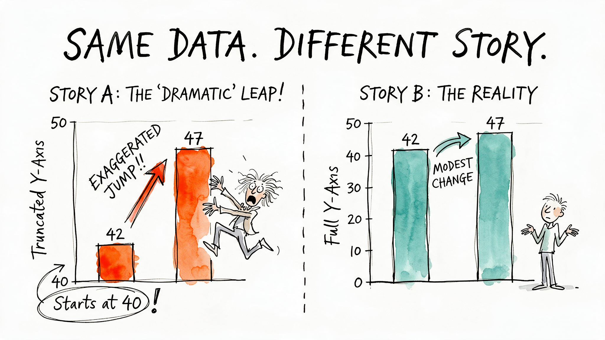
Image generated with AI
Conceptual techniques — ways of narrating correct data so audiences are led toward a preferred meaning:
Strategic framing — directing attention to one part of the evidence and away from another. In a hypothetical example the working session used to make the point safely, a girls' education project in an imaginary country ("Catlandia") could be framed as failing by highlighting a stagnant female enrolment share, while ignoring that the number of girls enrolled had actually grown — both readings drawn from the same table.
Data storytelling — pairing rising education spending with deteriorating school buildings invites an audience to infer mismanagement, even when both figures are accurate on their own.
Glass half-full/half-empty framing — the same fact told two ways. A country spending around 2.8 to 3 per cent of GDP on education can be framed either as chronic under-investment or as remarkable resilience, depending on which context is foregrounded.
Technical methods — presentational or statistical devices that make correct data look more dramatic, certain, or causally meaningful than it warrants:
Truncated y-axes — a chart looks more dramatic when its axis doesn't start at zero.
Withholding denominators — a percentage looks more solid when its base population, sample size, or margin of error is left out.
Cherry-picked time windows — one country's unemployment figures looked like a striking four-year improvement, until a longer view showed little more than a return to pre-pandemic levels.
Averages without distribution — a mean income can look "typical" even when most people earn far less than it suggests.
Aggregation hiding subgroup effects (Simpson's paradox) — schools that spent more on digital technology appeared to perform worse, until the data was broken down by municipality, at which point the relationship reversed.
Correlation mistaken for causation — more job applications "causing" higher unemployment, or, in a deliberately absurd illustration the group used to make the danger memorable, ice-cream consumption "improving" PISA test scores.
Why it happens
The report resists treating all of this as simple dishonesty. Participants linked misinterpretation to a range of pressures:
Strategic communication — the need to make a message land with a non-specialist audience.
Institutional and donor pressure — a partial account of a situation that felt like "the lesser evil" for keeping a project funded.
Policy and political pressure — keeping evidence aligned with decisions already taken.
Personal self-interest — such as an expert embellishing findings to justify a fee.
Making data more usable — simplifying a genuinely unstable or marginal result so it isn't over-read (the brain-drain example above).
Low statistical literacy — not knowing what you don't know, made worse, participants warned, by AI tools that can produce polished-looking outputs no one fully understands.
Loss of metadata — figures losing the notes and caveats that made them safe to interpret as they travel between institutions.
Weak verification culture — data accepted on trust because checking it properly takes time few teams have.
Guardrails: when is data misinterpretation legitimate?
The report's most provocative argument is that some data misinterpretation can be legitimate, even useful, as long as it stays within limits.
Fabricating or quietly altering figures was treated as an absolute boundary, never acceptable under any justification. Short of that line, participants argued that selective emphasis, simplification, or framing can be defensible, provided it serves a genuine professional or public purpose rather than personal, political, or institutional advantage, and provided it is disclosed: users need to be told what was left out, how the selection was made, and why. The report draws on the OECD's Integrity of Education Systems (INTES) framework, used in anti-corruption work across the education sector, which locates the difference between acceptable professional judgement and misconduct in whether someone knowingly departs from standards or obligations in pursuit of some personal benefit.
The brain-drain example that opens the article is offered as a model of the legitimate kind: the underlying data was not changed, the choice not to publish it at programme level was documented in the metadata, and the published results still covered almost the entire population concerned.
Why interpretation is a matter of integrity
The report's conclusion is that better data alone will not solve this. Data does not arrive in a policy debate carrying its own meaning — someone always decides what to highlight, what to compare, and what conclusions the evidence can reasonably support. Those decisions cannot be reduced to a fixed rulebook; they call for judgement, exercised consistently, under pressure, and in good faith. In the report's own terms, that is not ultimately a statistical question. It is a question of professional integrity.
Explore more of the ETF's evidence and monitoring work in the publications library and the data portal.
Frequently asked questions
Is data misinterpretation the same as fabricating data? No. The report treats these as fundamentally different. Data misinterpretation involves selecting, framing, or presenting accurate figures in ways that shape how they're understood. Fabricating or quietly altering the underlying numbers is described as an absolute boundary that is never acceptable, regardless of the justification offered.
Can data misinterpretation ever be legitimate? Yes, according to the report — under conditions. Selective emphasis or simplification can be defensible if it serves a genuine professional or public purpose (rather than personal, political, or institutional advantage) and if the choice is disclosed transparently, so users know what was left out and why.
What's the difference between data interpretation and data analysis? In the report's "data-to-meaning continuum," interpretation is about communicating what a result means for a given question or audience — selecting and framing elements of the data. Analysis goes a step further, seeking to explain why the results look the way they do.
Why does data misinterpretation happen so often? The report points to a mix of causes: pressure to make messages land with an audience, institutional or donor expectations, political pressure to align evidence with existing decisions, statistical literacy gaps, loss of metadata as figures circulate, and a general culture where data is accepted on trust rather than independently verified.
Did you like this article? If you would like to be notified when new content like this is published, subscribe to receive our email alerts.